Thursday, 17 November 2011

Target Audience

To research into my potential target audience for my acoustic music video, I have used the website www.surveymonkey.com to create my own survey that would require music video watchers to fill in and provide me with answers that will help me to think about typical locations, costumes and conventions associated with my genre. 
Here is a link to my survey:
www.surveymonkey.com/s/XWM3KYB


Using my media twitter account, I was able to share the link with my 'followers', and with my classmates who are within my target demographic. Using the 'response' tab on the website I am able to collect and analyse the replies to my survey.


From this I can see that the majority of people who have filled in my survey are between the 16-20 years demographic. This allows me to target that age group by looking at what type of responses they have given and planning my music video accordingly. 

These results allow me to see that the majority of my survey responses come from those you 'regulalry' watch music videos, which shows their interest and wider knowledge of conventions within music video.
Also that the most popular genre within my target demographic is 'Acoustic' and 'Indie', this shows their shared popularity and similarities when it comes to consumption.
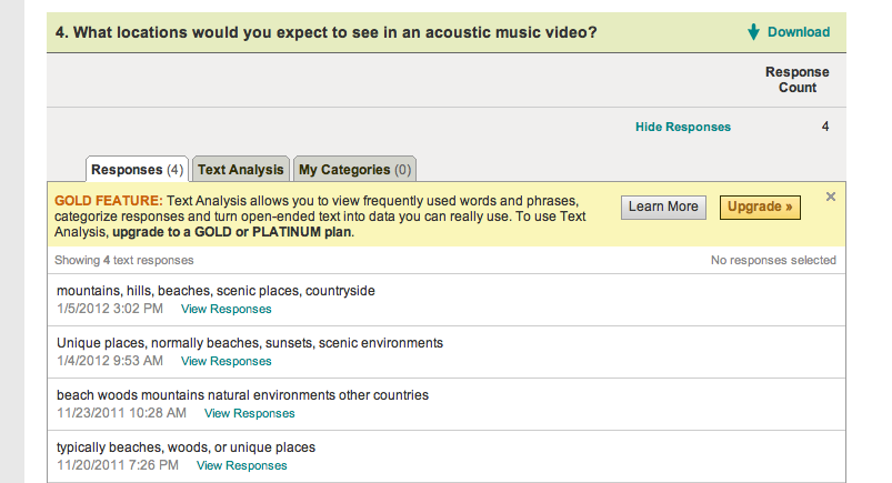


Open questions allowed me to gain responses that are rich in qualitative data, so that I can have a greater understanding of my target audiences ideas in relationship to locations and costumes. 
Ideas for locations were mainly focused on unique and exciting scenery, that defied typical locations for music videos like woods and the beach. 
Costume ideas highlighted the similarities between the indie music and indie style, with responses highlighting key fashion styles such as maxi dresses, sunglasses and bohemian clothing.


I included another open question, where it gathered data into other music videos they have watched, I have then watched these to have a better understanding of music videos that are seen as successful and meeting the conventions of indie/acoustic music videos. 

To gain a further and more developed understanding of my target audience, I have interviewed Megan White whom I believe is representative of my target audience. I was able to find out more details about the type of hobbies and fashion interests she has. Hopefully I will be able to incorporate this into my final music video, so that it will appeal to the target population. 


I have also looked at a potential member of my target audience;


This is Georgie Clifford, She is 18 years old and lives in Jersey.

Georgie studies, English Literature, Photography and Philosophy.
Georgie has a part-time job at a fashionable clothing store, and also takes part in singing, acting and dance classes. 
Georgie often spends her weekend at the beaches of st. Brelade and St. Quen, 
She often shops at vintage shops, Urban Outfitters and Topshop. 
Georgie's favourite films are; Shutter Island, The Notebook and Bronson. These are a mixture of thriller, romantic and indie genres. 
She normally listens to acoustic and indie; her favourite bands are Arcade Fire, Bombay Bicycle Club, Odd Future, Lana Del Ray and Adele. 


From the research I have collected on my target audience, I believe that Georgie is a good representative of this sample. 
So I shared my ideas about my music video with her and she liked the idea of using a beach location and seconded my idea of St.Quens, saying it would be a cool location and there are lots of different shots available to use. 


Poster InDesign

I created another mock poster using InDesign for Little Boots's album, 'Hands'.
To fit her quirky and indie style of music, I used a neutral colour theme. This worked well as the album used more intense colours which were similar to the dress in the background photo. 

I choose a font that would be simplistic and not take away from the format but still be clear enough to understand and get attention. I particularly like the layout of this poster, with the digi pack in the top left corner where the background image had a gap.


Like in previous posts I then replicated the hmv logo and colour themes in the bottom right, this made a nice format as it was opposite to the album cover, this spread out the information on the poster and allowed for a sophisticated layout, where I could use all of the space provided in a useful way.


This is my final poster design for Little Boots, I believe this is one of my most successful posters, as the colour theme and layout work particularly well with the artists style and music genre. 
Within my own ancillarly task to create a poster I would like to create a similar format to this with the close-up to medium short of the artist, with information presented around it.

Wednesday, 16 November 2011

Poster InDesign

For my inDesign practice I also used a promotional photo of Ellie Goulding.
I like the base photo as it's interesting and highlights a possible narrative, it's different from previous photos where they are based in a studio in a photo shoot. The outdoor environment makes the photo more engaging. It also has a cool cross developed style to it, which allows you to have a wider colour scheme. 


I imported the Digi Pack cover of Ellie Goulding's CD, Bright Lights. 
The cover has a similar type of natural vibe to it so fits well with the poster. I positioned it in the bottom right corner because it allows for a split attention and the composition works well. 


I then produced a text box and played around with different fonts, until I found one that I believed worked, I choose a font that was thing and using the tool box increased the length of the letters. I choose a whitey-cream colour, to match the natural envrionment and corn type plants in the background. The pale colour also made a night contrast to the purpley blue trees and matched prominent features of Ellie, like her hair. 


I then did the same for the title of her album, 'Bright Lights' and choose a teal colour to again highlight the natural colour effect, and her coat. I made the writing smaller than the artists name, as throughout my research this has been a convention within all digi-pack designs. As the artist is well-known to populations and therefore by making this bigger will attract attention and sales. 
I then like before imported the HMW logo, and added 'pre order now at' as this is also prominent for hmv promotional posters. I used a similar font to the HMV logo, and made it smaller in the black so that it did not overpower it.


This is my final promotional poster for Ellie Goulding, I like this one compared to my others because of it's wider colour scheme, it's photo is more typically 'indie' because of the clothing and style of the artist being clearly shown. As well as the vintage style colours.

Poster InDesign

I also used InDesign to create a poster for Adele, I chose to use a background image of the artist in black and white, this shows continuity as the digi-pack's album cover also follows the black and white colour scheme.


Poster InDesign

After my research of posters, I have come to understand that the most successful ones are those that provide the key information, such as artists name, album name, the distributors logo, date of sale and tour dates. 
I have tried to create a similar poster, that would advertise through the form of posters a promotional album advertisement. As i have decided to use a female solo artist, i decided to use the artist Florence Welch from Florence and The Machine, to create my first poster around.


Using the program InDesign i have been able to edit text and photos, to arrange in an appropriate manner that meets the conventions of my HMV poster. I have used the HMV iconic pink font along with their logo of the dog listening to the gramma-phone, this is a recognizable feature of the HMV distributor. 
Along with this, I have included the image of Florence and The Machine's new album digi-pack cover, 'Ceremonials'  this lets the audience know the product that I am trying to market for the poster. This is emphasized by the background image of Florence and the Machine, i choose a photo of a live performance to enhance the 'live music' type of vibe for the album.


This is my final poster for my digi-pack album of 'Florence and The Machine' with her new album, 'Ceremonials'. I choose the whit font because of it's bold contrast to the black, this is complemented by the black and white image of Florence that is in the background. I also choose to use fonts that were similar to the digi pack colour so that i could establish a continuity within the poster. 

Thursday, 3 November 2011

Indesign Pratice


This is the CD disc artwork, i like the way it is different from other artwork, as it does not use a photograph of the artist, instead it uses a still life image. The roses, highlight the romantic style of music and themes that are within the album. 

This is the back cover of my digi pack, it meets other conventions such as a bar code, a industry logo, as well as a track list for the album. I like the way that the track list is around the image of Florence and doesn't overlap, this provides for an extra panel to feature an image of the artist, as well as efficiently displaying the song lists. 
It also follows the same colour themes, because of the reds and the oranges, which complement her iconic hair colour. 

Here is my 4 panel layout, I think it is a successful digi-pack as it meets all the conventions expected and is appropriate to both genre and style of the artist. Features such as the text are mixed throughout to create a collage sort of effect, but some are repeated to add to continuity. 
Things that could be improved would be a tighter colour scheme, as the lyric panel does not seem to fit with the rest of the layout. 

Friday, 7 October 2011

Indesign Pratice


This is a shot of the 4 panels that would make up my digi-pack for my Marina and the Diamonds album.


This is the front cover of the album, I choose to have the font in the format of a diamond shape, to emapsise the imagery of the album title, 'Family Jewels'. Also the image i choose for the cover, has a close up shot of the artists, which throughout my research i decided would be the most effective style. However the image is still unique and quirky due to the overlapping images of her, in a type of stylised kalidoscope effect, which would be found in the image of a jewel. 


This is the back of the CD cover, instead of the red, oranges and black that i used on the front cover i decided to highlight Marina's ecentric style of fashion and unique vibe so choose the opposing colour blue. However through my research i have noticed the important of having some constant fixtures to make sure the album flows together, this is why i have stayed with the same font for listing the track lists. 
I also mirrored the font on the other side, to highlight the images used of multi exposure and pictures, illuminating the jewel connotations further. 
I also have the generic features of the album such as the barcode and commercial and product images. 


This is the cd artwork for my digi pack of Marina and the diamonds. 
I think this one is very effective