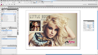
I created another mock poster using InDesign for Little Boots's album, 'Hands'.
To fit her quirky and indie style of music, I used a neutral colour theme. This worked well as the album used more intense colours which were similar to the dress in the background photo.
Like in previous posts I then replicated the hmv logo and colour themes in the bottom right, this made a nice format as it was opposite to the album cover, this spread out the information on the poster and allowed for a sophisticated layout, where I could use all of the space provided in a useful way.
This is my final poster design for Little Boots, I believe this is one of my most successful posters, as the colour theme and layout work particularly well with the artists style and music genre.
Within my own ancillarly task to create a poster I would like to create a similar format to this with the close-up to medium short of the artist, with information presented around it.


No comments:
Post a Comment