Monday, 21 November 2011

Photoshop Tutorials

I have started to complete a tutorial using the program photoshop, so that i can learn about the editing software and it's effects that I can possibly use within my poster and digi-pack task. 
I followed the following tutorial link;
www.photoshoptutorials.ws/photoshop-tutorials/photo-manipulation/how-to-create-a-traditional-painting-like-surreal-image-using-photoshop/Page-1.html


Equipment Video

I have created a short video of myself using the equipment that I will be using to film my final music video. This includes the Cannon 7D camera, which because of it's options I can use for both my music video shooting and my photo shoot for my ancillary tasks of my digi pack and promotional poster. 
I have experimented with the cameras depth of field, aperture and ISO.
I have also used the crane, tripod and dolly to show how I can use movement whilst holding a still shot. 


Another way I have used the equipment is through creating a mock music video.
We worked together in groups over a week to run through the basics of what it will take to make a music video. This included using the Cannon 7D, Tripod, drawing mock storyboards, Choosing a track and actress and filming on location.
Through doing this I have been able to see how planning is crucial before setting out on set, things like having the music with you and playing loudly so your actress can stay in time is vital for successful lip-syncing.
Here is my groups final music video.
Please do not judge me on it...

Thursday, 17 November 2011

Storyboard + Animatic

I have drawn up some storyboards that will help to act as a rough prompt of what shots I will be hoping to film within my music video. 
I have chosen two locations, A theatre type setting with a stage, contrasting the outdoors of the sea. 
I am hoping to capture to indie genre through the use of focusing my music video on the live performance elements which will illuminate the music of Florence. This will create a powerful impact because of the live movements.

 
I like these type of shots, on the seats of the theatre, It is a different location, and highlights a more sensitive side to the performance, the empty audience will highlight the vulnerability and sensitivity of the performance, and show the exclusiveness. 
This is fitting as the song focuses on self-expression and demons, so this will be a fitting setting as it will allow for a vulnerable environment. 
I like the mix of close-up to medium shots, which will be fitting within my sequence, keeping engagements within the audience.
The second lot of storyboards I have done are at the beach, this works well with the inclusive theatre environment before, with the vast open seaside, where it shows freedom and raw qualities. 
I will be filming within winter so there should be an atmospheric quality to the sea, which will set a moody tone to the video. 
It will also be a great opportunity to use panning shots across the wide open beach, and use filler shots, to not just be focused on the actress. This will increase engagements and interactivity between audience and actors. 
I have then used more storyboards within the stage, the use of the microphone will allow for shots that will use depth of field, and create interesting images, with silhouettes and outlines, within the light shining. 
I then created an animatic with each of the parts of my storyboard, to my selected song for my music video. This would provide me with a basic understanding of what I will be hoping to do, and to provide me with experience on cutting to the beat
Here is my final animatic;


http://youtu.be/PzA4l485QAM

I then uploaded my animatic onto my youtube channel, and in class discussion was able to gain feedback from it.


 Here are some of the comments that I received: 

- Nice selection of shots, relevant to the music
- Some type of narrative, maybe develop this later?
- Good editing pace, to the beat and not too fast for the song
- Meets conventions for an Indie Music Video
- Great use of equipment and shots, maybe have more filler shots? Shot focused on objects and not on locations or singer
- Use more movements, panning shots etc. 
- Effective use of sequence of close-up, medium, long and location shots, work well to keep audience engagement within the video. 
- Quite repetitive shots, maybe a third location? Or a type of action, or natural shots of the actress, maybe use more actors within some shots.  

*UPDATE*

However when arranging a date to film on, I had problems getting my stage location, and therefore had to come up with a back up. I therefore decided to film it all in a beach location, but in different parts, so the beach, the sand-dunes and the sea. 
This would still show diversity in locations, and hopefully the sea footage would look unique and different. 
Combining all of these natural environments will hopefully work really well in creating an indie vibe in my music video. 

Props and Costume.


Props
I will be using natural props like, wood, flowers, straws etc. To highlight the natural and raw essence of the music. The interaction between my actress and the prop will provide dynamics within my music video, which will be useful for filler shots. 

Later on I also decided to add in another prop, a notebook, which my artist was filmed writing down lyrics in, this was done to add a narrative throughout my music video. Also making the video more personal, and showing a direct relationship between the song lyrics with the emotion. 


Costumes
From my research I have seen that one of the most important factors for an indie music video is the fashion. There is a clear style within these videos of a very fashion conscience female artist with a unique and bohemian style. I have looked online on clothing sites such as http://www.topshop.com and  http://www.urbanoutfitters.com to provide me with more ideas of items that are seen throughout the indie style. 


This is one of the outfits that my model will be wearing within my music video. 
I like the brown and orange colours in the top and jacket, as they compliment each other and give a bohemian boho style which meets the convention of the indie-acoustic genre. 
I like the way the skirt provides a lighter side of the outfit, through the flouncy, joyful like qualities which makes it more quirky like other female artists that I have looked at like Kate Nash and Marina and The Diamonds.
The whole outfit altogether has an organic type of vibe, which looks cool with Jodie's hair colour and style as well, as it's big and wild, looks very natural, which will compliment the natural settings that I will be using to film at.

iCal

To manage my coursework timings, I have created iCals to help me complete tasks within a certain time.
Here is my iCal for the months of September, October, November, December and the start of January.
Over the course I have found using iCal has helped me to manage my time and provide me with objectives throughout the week to help me stay on track and have all the relevant parts of my coursework complete.

In september my main aim is to research music videos to gain a better understanding of convention and ideas for my final music video. 
I will be researching video within the indie/acoustic genre. 
I will also start researching some of the same artists posters, for tours, and album releases. 
This was especially important was i was away for 3 weeks in India, and therefore as i wanted to film my music video whilst over there I would have to have gathered data for my target audience, conventions, actress, location and storyboards before I would leave.


Location and Actress

After carrying out research, I have decided to use two different locations. 
I have gained inspiration for my first location from videos from Florence and the machine and Mumford and sons, as they use a performance area, like a stage and use effective lightning to create an atmosphere.


For my second and main location, I have chosen a beach. Living in Jersey provides the perfect beach environment, and I will be filming on St Quens beach.
I have filmed some of my locations, to practice some of the shots that I may use within my music video.


I believe my beach location will highlight the natural and calmness in the music video, away from the busy city etc. to a tranquil and isolate location. With the sun sea and sand. 

I have carried out auditions for the actress who will be the female solo artist within my music video.


From my auditions I really liked megan, as she showed enthusiasm, but some parts of the audition her lip-syncing was unclear, whereas georgie throughout gave a clear and precise lip sync of the song.
However even though Jodie wasn't auditioned I am picking her to be my main actress in my music video, because of her enthusiasm and interest into the project. Jodie is 17 and has a past in acting and singing this will help within my music video and I believe will give me a successful project.
I also believe Jodie's style and look will fit the convention associated with female solo artists within the indie genre. 


Song Ideas and Final Choice.

After gathering data from my target audience and finishing my music video research I have decided to produce my music video within the acoustic/indie genre. 
This is because I believe I can produce a successful acoustic/indie music video that will meet conventions and appeal to the target population of 16-20 year olds, as I am within this age demographic, I can use my input of what I like within the genre to make it unique and exciting.
I have also chosen to use a female singer, as I have done a lot of research into female solo artists and have become interesting in ways in which they appeal to the demographic and how they can highlight and encourage enthusiasm and individuality within the music video. 

My initial ideas for songs are;

Ellie Goulding - Your song

Birdy - Skinny Love


I liked all of these song choices, because of the strong and unique tone of voice from the female artist.
I have decided to choose Florence + The Machine - I'm not calling you a liar.


I have chosen this song because I believe it would be believable for my actress miming the lyrics. 
I also like the upbeat quality to the song, I will try to also put in a narrative in the piece. 
Looking at some of the lyrics, the song is about a romantic relationship between the singer and a ex or current boyfriend. It's about the struggle of trust, vulnerability and commitment, I can show this through my locations such a empty spaces, and large environment. By having my actress as the only person in my music video It will show her struggle, as she will be alone.

Going onto Florence's myspace page, on http://www.myspace.com/florenceandthemachine/ I left a comment asking permission to use her song, 'I'm not calling you a liar' in my music video.


Target Audience

To research into my potential target audience for my acoustic music video, I have used the website www.surveymonkey.com to create my own survey that would require music video watchers to fill in and provide me with answers that will help me to think about typical locations, costumes and conventions associated with my genre. 
Here is a link to my survey:
www.surveymonkey.com/s/XWM3KYB


Using my media twitter account, I was able to share the link with my 'followers', and with my classmates who are within my target demographic. Using the 'response' tab on the website I am able to collect and analyse the replies to my survey.


From this I can see that the majority of people who have filled in my survey are between the 16-20 years demographic. This allows me to target that age group by looking at what type of responses they have given and planning my music video accordingly. 

These results allow me to see that the majority of my survey responses come from those you 'regulalry' watch music videos, which shows their interest and wider knowledge of conventions within music video.
Also that the most popular genre within my target demographic is 'Acoustic' and 'Indie', this shows their shared popularity and similarities when it comes to consumption.


Open questions allowed me to gain responses that are rich in qualitative data, so that I can have a greater understanding of my target audiences ideas in relationship to locations and costumes. 
Ideas for locations were mainly focused on unique and exciting scenery, that defied typical locations for music videos like woods and the beach. 
Costume ideas highlighted the similarities between the indie music and indie style, with responses highlighting key fashion styles such as maxi dresses, sunglasses and bohemian clothing.


I included another open question, where it gathered data into other music videos they have watched, I have then watched these to have a better understanding of music videos that are seen as successful and meeting the conventions of indie/acoustic music videos. 

To gain a further and more developed understanding of my target audience, I have interviewed Megan White whom I believe is representative of my target audience. I was able to find out more details about the type of hobbies and fashion interests she has. Hopefully I will be able to incorporate this into my final music video, so that it will appeal to the target population. 


I have also looked at a potential member of my target audience;


This is Georgie Clifford, She is 18 years old and lives in Jersey.

Georgie studies, English Literature, Photography and Philosophy.
Georgie has a part-time job at a fashionable clothing store, and also takes part in singing, acting and dance classes. 
Georgie often spends her weekend at the beaches of st. Brelade and St. Quen, 
She often shops at vintage shops, Urban Outfitters and Topshop. 
Georgie's favourite films are; Shutter Island, The Notebook and Bronson. These are a mixture of thriller, romantic and indie genres. 
She normally listens to acoustic and indie; her favourite bands are Arcade Fire, Bombay Bicycle Club, Odd Future, Lana Del Ray and Adele. 


From the research I have collected on my target audience, I believe that Georgie is a good representative of this sample. 
So I shared my ideas about my music video with her and she liked the idea of using a beach location and seconded my idea of St.Quens, saying it would be a cool location and there are lots of different shots available to use. 


Poster InDesign

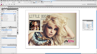
I created another mock poster using InDesign for Little Boots's album, 'Hands'.
To fit her quirky and indie style of music, I used a neutral colour theme. This worked well as the album used more intense colours which were similar to the dress in the background photo. 

I choose a font that would be simplistic and not take away from the format but still be clear enough to understand and get attention. I particularly like the layout of this poster, with the digi pack in the top left corner where the background image had a gap.


Like in previous posts I then replicated the hmv logo and colour themes in the bottom right, this made a nice format as it was opposite to the album cover, this spread out the information on the poster and allowed for a sophisticated layout, where I could use all of the space provided in a useful way.


This is my final poster design for Little Boots, I believe this is one of my most successful posters, as the colour theme and layout work particularly well with the artists style and music genre. 
Within my own ancillarly task to create a poster I would like to create a similar format to this with the close-up to medium short of the artist, with information presented around it.

Wednesday, 16 November 2011

Poster InDesign

For my inDesign practice I also used a promotional photo of Ellie Goulding.
I like the base photo as it's interesting and highlights a possible narrative, it's different from previous photos where they are based in a studio in a photo shoot. The outdoor environment makes the photo more engaging. It also has a cool cross developed style to it, which allows you to have a wider colour scheme. 


I imported the Digi Pack cover of Ellie Goulding's CD, Bright Lights. 
The cover has a similar type of natural vibe to it so fits well with the poster. I positioned it in the bottom right corner because it allows for a split attention and the composition works well. 


I then produced a text box and played around with different fonts, until I found one that I believed worked, I choose a font that was thing and using the tool box increased the length of the letters. I choose a whitey-cream colour, to match the natural envrionment and corn type plants in the background. The pale colour also made a night contrast to the purpley blue trees and matched prominent features of Ellie, like her hair. 


I then did the same for the title of her album, 'Bright Lights' and choose a teal colour to again highlight the natural colour effect, and her coat. I made the writing smaller than the artists name, as throughout my research this has been a convention within all digi-pack designs. As the artist is well-known to populations and therefore by making this bigger will attract attention and sales. 
I then like before imported the HMW logo, and added 'pre order now at' as this is also prominent for hmv promotional posters. I used a similar font to the HMV logo, and made it smaller in the black so that it did not overpower it.


This is my final promotional poster for Ellie Goulding, I like this one compared to my others because of it's wider colour scheme, it's photo is more typically 'indie' because of the clothing and style of the artist being clearly shown. As well as the vintage style colours.

Poster InDesign

I also used InDesign to create a poster for Adele, I chose to use a background image of the artist in black and white, this shows continuity as the digi-pack's album cover also follows the black and white colour scheme.