Friday, 7 October 2011

Indesign Pratice


This is a shot of the 4 panels that would make up my digi-pack for my Marina and the Diamonds album.


This is the front cover of the album, I choose to have the font in the format of a diamond shape, to emapsise the imagery of the album title, 'Family Jewels'. Also the image i choose for the cover, has a close up shot of the artists, which throughout my research i decided would be the most effective style. However the image is still unique and quirky due to the overlapping images of her, in a type of stylised kalidoscope effect, which would be found in the image of a jewel. 


This is the back of the CD cover, instead of the red, oranges and black that i used on the front cover i decided to highlight Marina's ecentric style of fashion and unique vibe so choose the opposing colour blue. However through my research i have noticed the important of having some constant fixtures to make sure the album flows together, this is why i have stayed with the same font for listing the track lists. 
I also mirrored the font on the other side, to highlight the images used of multi exposure and pictures, illuminating the jewel connotations further. 
I also have the generic features of the album such as the barcode and commercial and product images. 


This is the cd artwork for my digi pack of Marina and the diamonds. 
I think this one is very effective 


Monday, 3 October 2011

Indesign Pratice

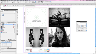
Using InDesign I created a layout for my digi pack for 'I Blame Coco' album 'The Constant'.
I used images that were black and white, to create and indie rocky edge style, this also increased the fluency and style of all the photos, making the digi pack look professional and fitting. 


I chose the white font on the album cover, because of the contrast with the black image behind it, it also emphasised the overall black and white theme. I like the font because of the harsh letters, in an understandable way, I then used a type writer style font a bit smaller for the album title.


It was important to meet convention of digi-packs, such as choosing a suitable label to have on the album, I choose Sony BMG, and using photoshop was able to remove the white background and have a transparent background so that it did not stand out to much and looked more professional.


I also choose to use this mirrored image of coco on the back cover and formatting the track list of the album inbetween them, this seemed like a cool and unique idea, it also made the back page more interesting and gauging more of the audiences attention.


For the CD cover, I liked the 3 overlapping segments of the images, it is very engaging and works well in the circular format of the CD. The artists face also makes the CD recognisable.


Overall I believe this was a successful attempt at my digi-pack draft, I believe the black and white colour theme works particularly well with this style of artist, but maybe a few more colour segments would be useful to brighten it up and to show diversity within the pack.